Our print collateral should maintain brand consistency, using the approved colors, fonts, and logo placement. All materials should be visually aligned
with the brand’s identity
One Page Flyer
Design should be minimal and impactful, using bold visuals and clear messaging. The logo placement should be prominent, with primary colors and fonts used consistently.
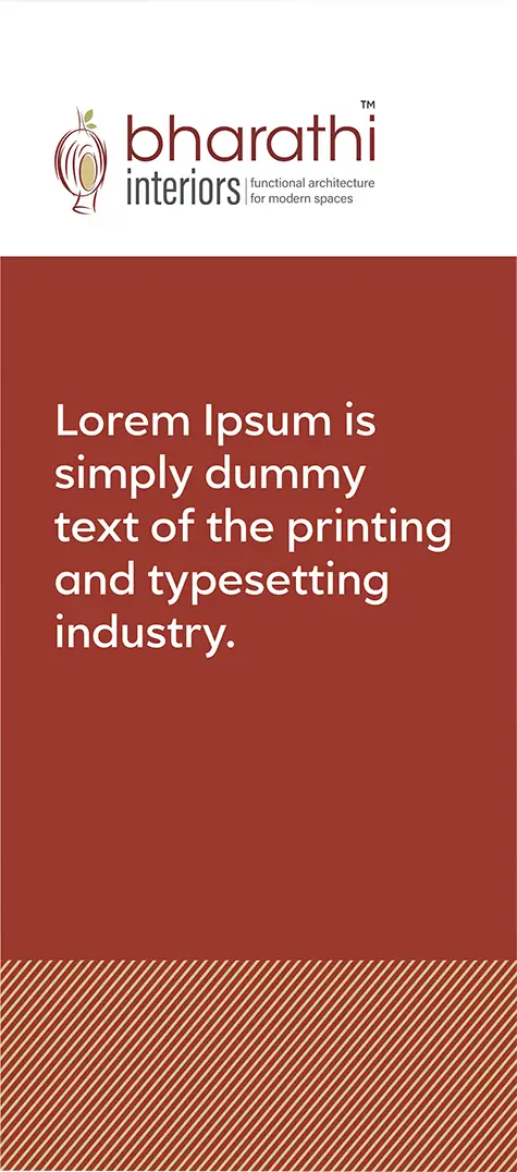
The tri-fold brochure should follow a structured layout, balancing text and imagery. Ensure the brand’s primary elements—logo, colors, and typography—are integrated seamlessly across all panels.
Brochure
For detailed brochures, focus on clean layouts that support readability and high-quality imagery. Maintain consistent use of the brand’s core visual elements to strengthen identity.
Example Brochure using a color background with white text/logo, an arrow/line/circle combination, and a well-chosen stock image
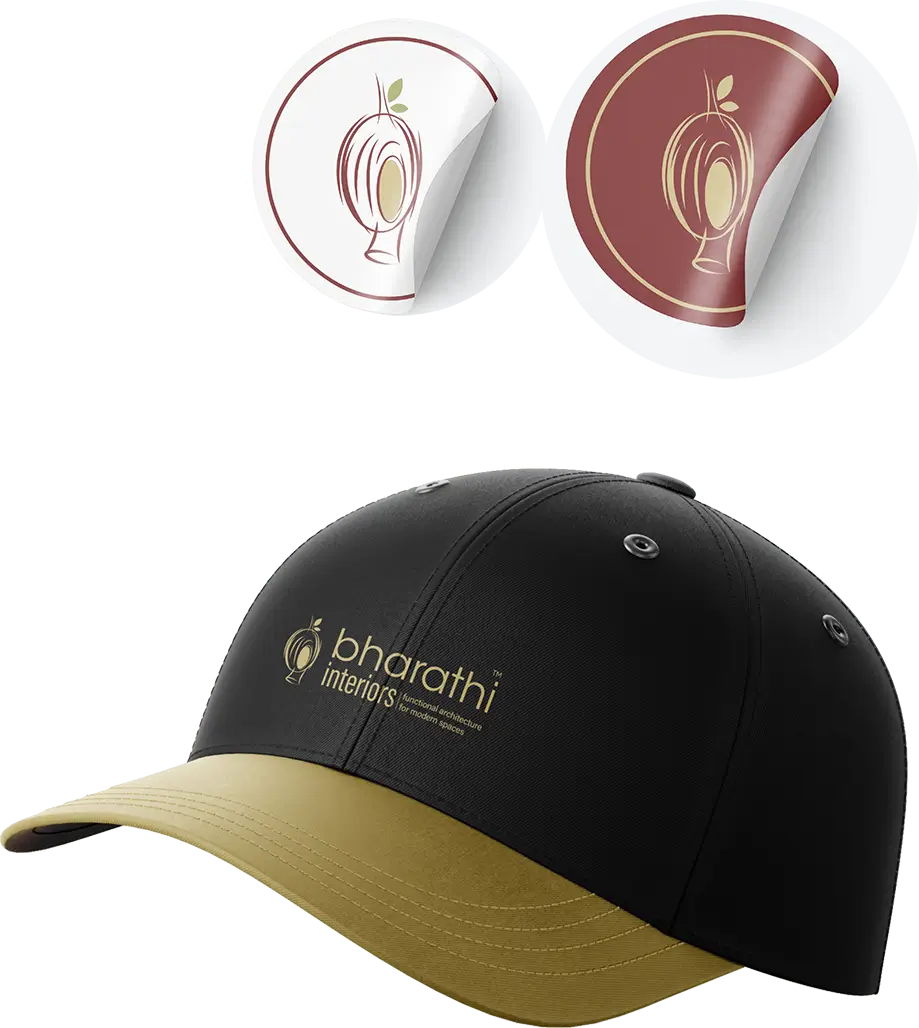
Promotional Items
When designing promotional items, ensure the logo is applied correctly and visible. Stick to the primary color palette and avoid overcomplicating designs, keeping the brand message simple and consistent.