Bharathi Interiors’ color palette is a harmonious blend of Burnt Umber, Burly Wood, and Olive Green. These colors are carefully chosen to reflect the brand’s connection to nature. The earthy tones highlight the brand’s focus on interior design that brings the natural beauty of wood and the outdoors into modern living spaces.
High-contrast colors ensure readability and accessibility, supporting clear visual communication for all users, including those with visual impairments.
Aa
Aa
Aa
Aa
Aa
Aa
Accessibility
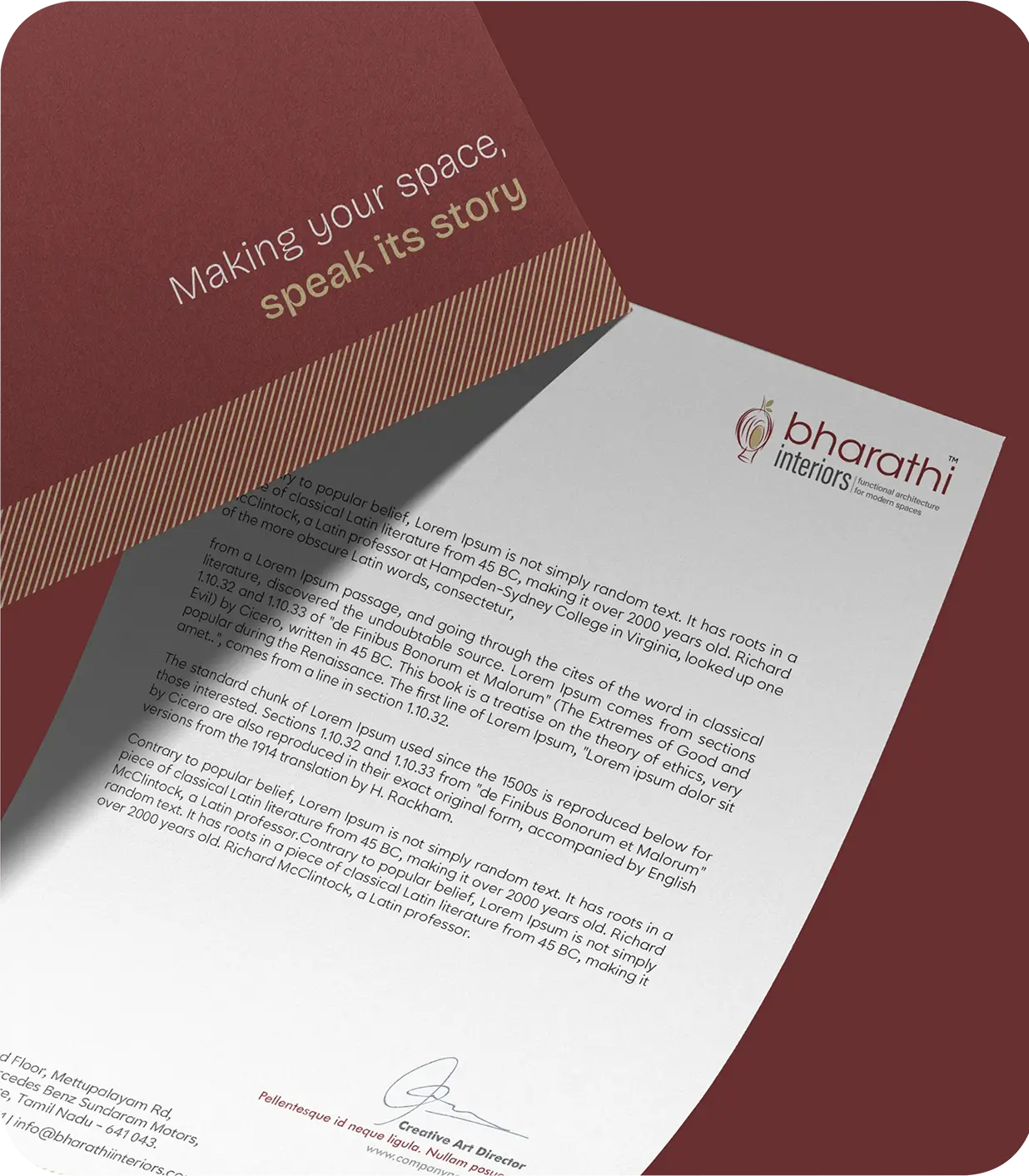
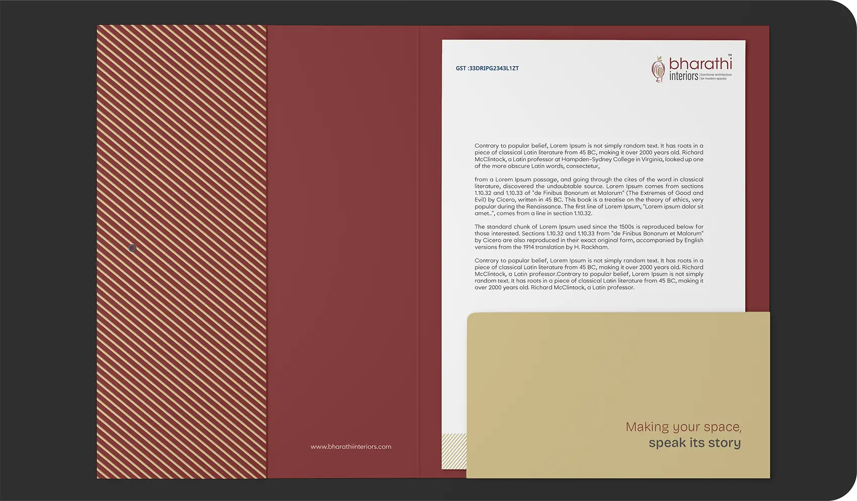
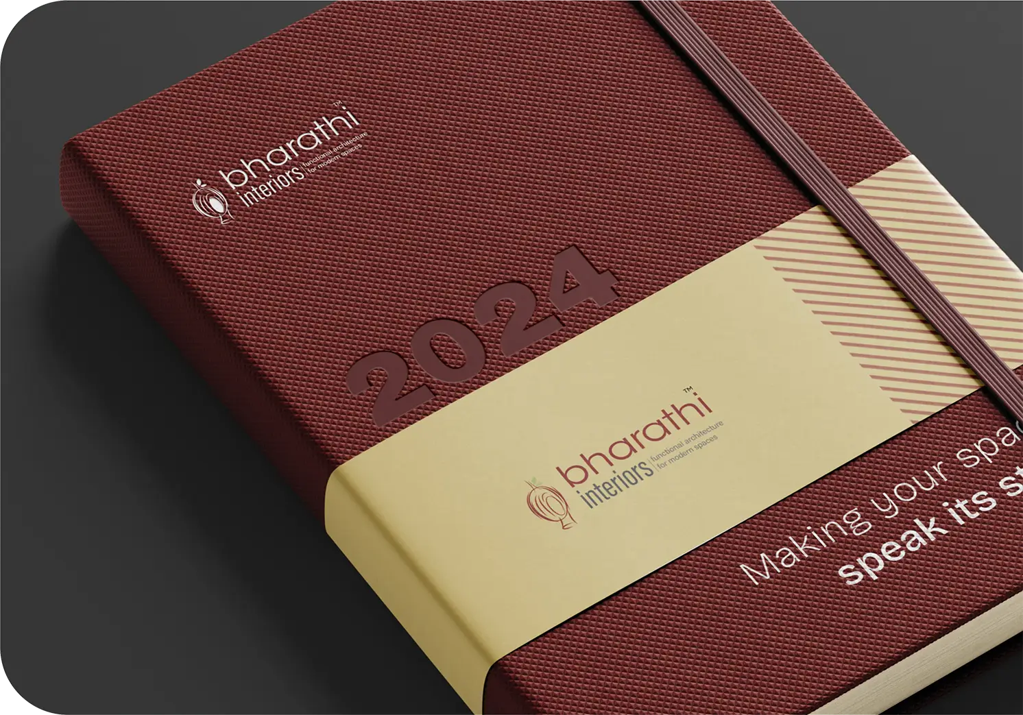
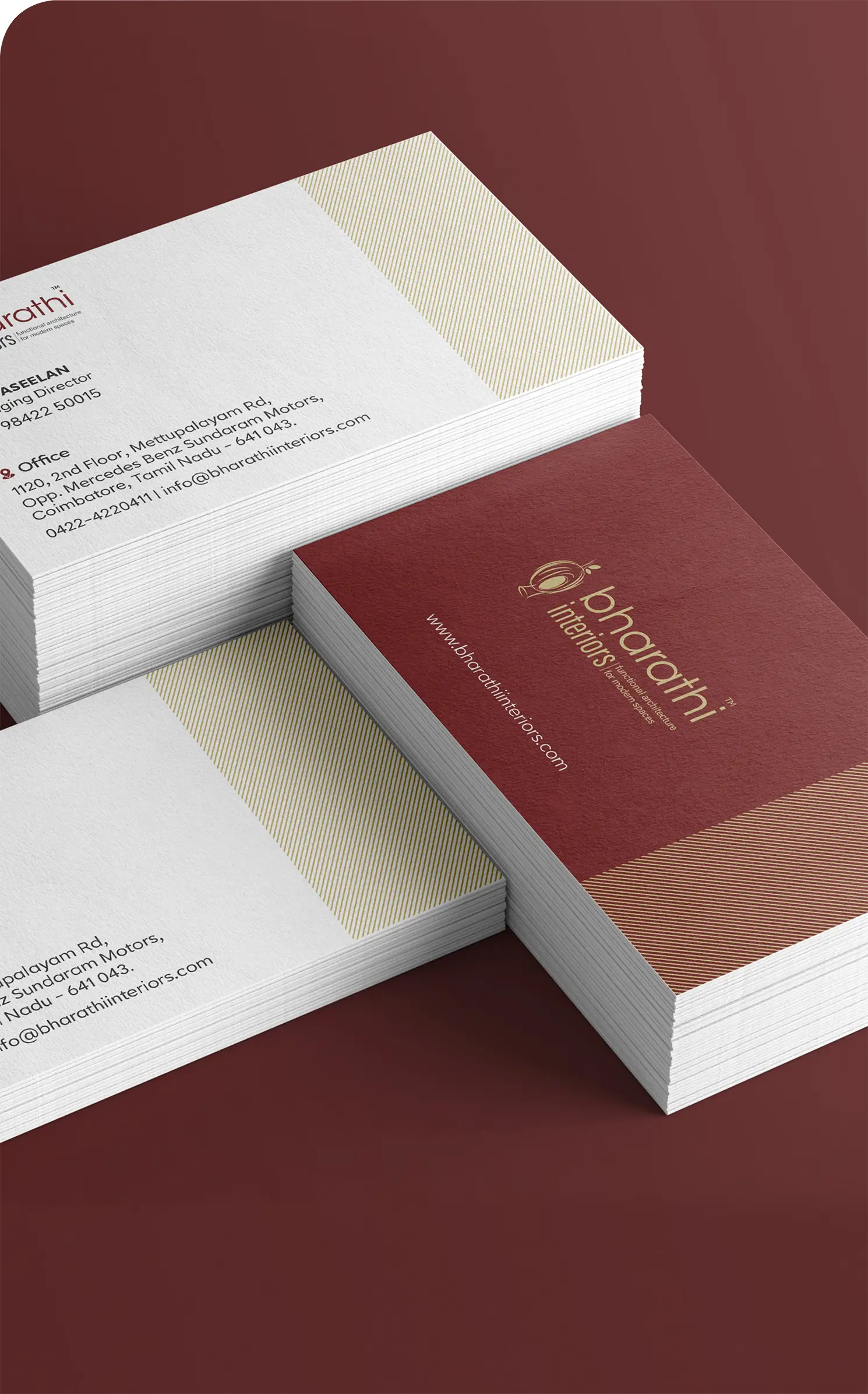
Inspired by the Weaver bird’s nest, the visual suite emphasizes creativity and function, reflected across stationery and design elements.
Colors For Type
Text is Burnt Umber, White, and Black, ensuring clear visibility and cohesion with the brand’s natural theme.