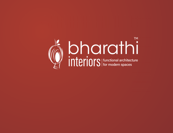
Inspired by the Weaver bird’s nest, our logo relects creativity, adaptability, and functionality. It symbolizes the blend of beauty and practicality, mirroring nature’s ingenuity in crafting intricate, resourceful designs.
As our most recognizable symbol, our primary logo represents creativity
and functionality. It is designed for clarity and adaptability, ensuring
visibility on any medium, both up close and from afar.
Construction
Our logo combines a Weaver bird’s nest icon with modern typography, ensuring a balance of creativity and functionality. It’s designed for clarity and legibility across all platforms and sizes.
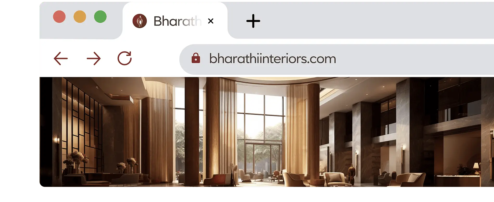
Our favicon features the distinctive Weaver bird’s nest icon, symbolizing our brand’s commitment to creativity, adaptability, and functional design. Its simplicity ensures easy recognition across browsers and devices, reinforcing our brand identity
Logo sizing & spacing
The logo should maintain proper proportions with equal space on all four sides around it, this ensures visibility and prevents crowding in all applications.
Minimum Size
To guarantee visibility and clarity, it’s important not to present the Bharathi
Interiors Logo in a size smaller than 0.98 inches(25mm) wide. For digital
applications, never reproduce the logo below a width of 100px
Depending largely on the page’s content, you can place the logo on any of the four corners to ensure visibility. Additionally, when no corners are available on the page, the logo can be positioned in the top middle. The
primary option is that the logo be used in the top left.
Logo Don’ts
Our logo is our asset, please treat it with utmost respect. These are the
ways you should not use the logo.
Do not change the logo color
Do not redraw the logo
Do not stretch, rotate or distort the logo
Do not use the logo as a decorative graphic
Do not outline the logo
Do not add shadows/effects to the logo
Do not crop the logo
Do not remove any elements
Logo Extention’s
Our logo can be enhanced with group names to specify the brand in communication. This involves incorporating a solid line and placing the group name to the right of the core logo.
Partner & Sponsor Co-branding
Any logo used along with our logo should be the same size, with equal spacing between them, ensuring balanced and cohesive brand representation.